Introducing our new improved education solution!
Same information. Modern and intuitive design. Enhanced user experience.
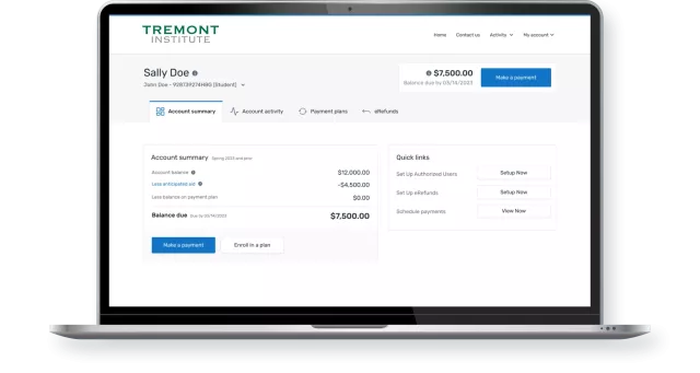
All the product capabilities you know and love with a new look and feel.
More intuitive design
- Easier navigation leads to a more transparent payment process and better user experience
- Prioritizes and highlights the information most important to the user like balance owed
- New information architecture to display relevant content based on user navigation
- Clearer visual hierarchy to identify the most important elements and remove inconsistencies
- Customization options like secondary button color without impacting accessibility or readability
Mobile responsive enhancements
- Better visualization and adaptation for mobile devices
- Easier navigation between the different sections/tabs
- Enriched accessibility performance and mobile access

Purpose-built for students
- New UI designed based on user behavior analytics and direct feedback from students
- Analytics tools used to inform design improvements in the payment journey
- Updated backend infrastructure will support new language options in the future
- Students tested and validated that the new design is easier to navigate and complete tasks
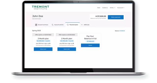
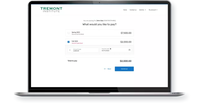
Improved ‘Make Payment’ flow
- Clarified options when paying a payment plan
- Display term-based or combined balance due payable items
Experience the difference.
Check out our new improved education solution here.
You will have the opportunity to familiarize yourself with the new solution before being migrated later this year. Keep an eye out for more information!
Contact Our Sales Team
Sorry, there was a problem.
You'll find more details highlighted below.
Thanks for your interest.
We will contact you shortly to schedule a demo!